Usage Guide - ResultsExplorer
Contents
- Introduction
- Menu
- Chart Menu
- Demand vs. Supply (Primary Energy and Biomass Potential)
- Short Rotation Coppices
- Short Rotation Coppices Boxplots
- Geographic Information System
- Forest Wood Potential
- Wood Outside Forest Potential
- Administrative Units
- Economy
Introduction
The ResultsExplorer is the central unit for exploring the scenario simulation results. It is always started from the ScenarioGenerator - either by opening from the menubar or by running a scenario simulation. The ResultsExplorer frame is separated into a tree navigation on the left and a results presentation on the right. When results data are loaded the name of the region is written into the frame title - here Region: Dummy. A .beast file does not necessarily contain scenario simulation results. One .beast file can only contain one result dataset. The corresponding inputs and parameter files of the scenario simulation results are stored in the same .beast file and can be visualized by loading it into the ScenarioGenerator. Results are generally presented separately for the two output periods 2011-2030 and 2031-2050 via register tabs.
Menu
Using the File menu at top of the frame enable you to load, save and export results. By selecting a .beast file including a results dataset you can load scenario simulation results into the ResultsExplorer. Using the Save as... menu item enables you to save the inputs, parameters and results in a new .beast file. The various export functions enables you to export the parameters, inputs, and results to XML and CSV files for usage in other software, like statistical analysis applications.
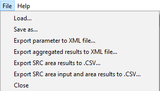
Chart Menu
On all charts, you can open the chart context menu by pressing the right mouse button. You can change the visual appereance of the chart, copy the chart to clipboard, save and print it, as well as change the zoom factor and range.
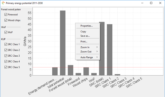
Demand vs. Supply (Primary Energy and Biomass Potential)
This table delivers the central results by presenting the given demand and the opposed potentials, which shows if the demand can be covered and how. The results of SRC are presented as a total sum as well as separated into different preference classes depending on the criteria value (see documentation).
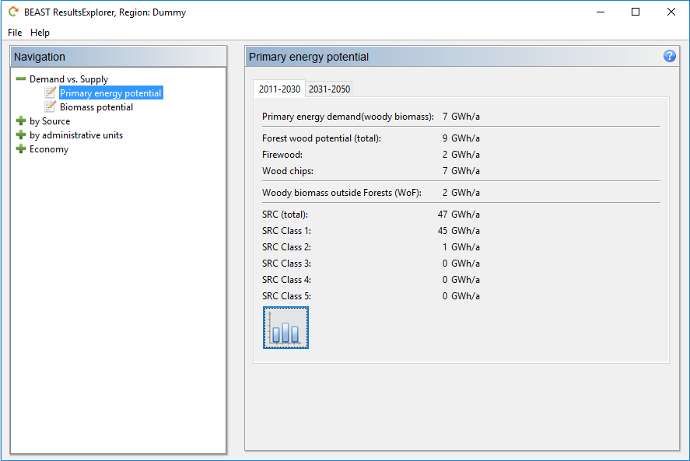
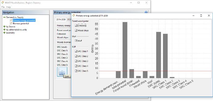
Pushing the chart button at the bottom opens a visualization of the demand and potential results. The first bar gives the total demand and the second shows the total potential from the different biomass sources. The horizontal red line shows the energy demand, which should be reached by the supply to fulfill the energy goal. On the left side, you can compose the energy supply mix be checking the different sources off or on. The graph is dynamically updated. Therefore, you can check which sources are necessary to reach the energy goal.
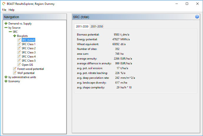
Short Rotation Coppices Potential
In the section by Source > SRC, the scenario simulation results are presented in tables for the total potential as well as, in the same manner, separated for the different preference classes depending on the criteria value (see documentation). The annual potential biomass and energy supply is presented. Several further key performance indicators are shown, such as wheat equivalent being lost if all corresponding fields are used for SRC, the number of fields in the corresponding preference class, and the resulting area sum in hectares. Moreover, two economic indicators are shown: the averaged annual annuity per hectare as well as the annuity difference to a reference field crop rotation. The last five indicators are the averaged ecological criteria over the sites in the corresponding group (total or a specific SRC preference class).
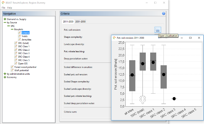
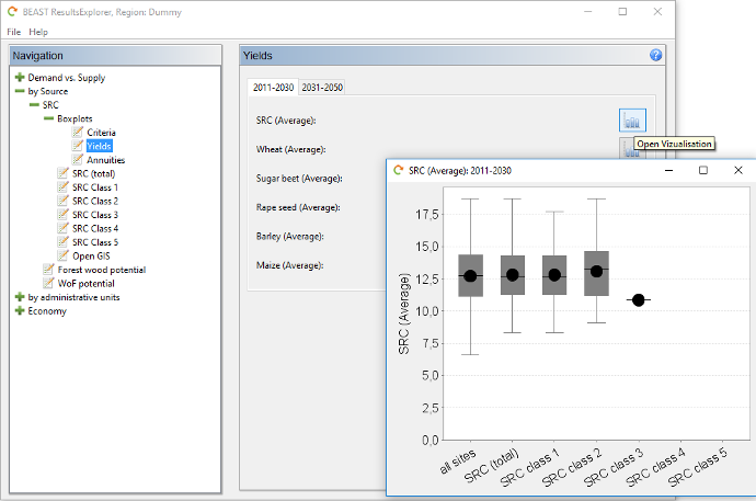
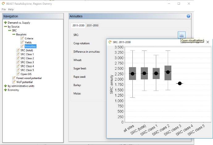
Short Rotation Coppices Boxplots
In the section by Source > SRC > Boxplots you can find boxplot visualizations of the scenario simulation results for SRC. Three thematic groups are available in the navigation tree: Criteria, Yields, Annuities. By pushing the button on the right you can open the corresponding boxplot. You can visualize the results for the different criteria, such as susceptibility to water erosion, shape complexity, etc., in absolute values as well as in scaled criterion values. Furthermore, you can have a look on the criteria sum.
For the yield results you can request boxplots for the averaged yield of SRC and for the different field crops. You see boxes for all sites of the research area, only for the potential SRC sites and further differentiated for the different preference classes.
In the same manner as the yields, the results for the annuities are presented. You see boxes for all sites of the research area, only for the potential SRC sites and further differentiated into the different preference classes.
Geographic Information System
The MapViewer is described here.
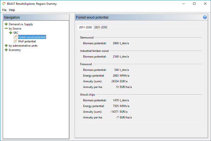
Forest Wood Potential
The table presents the results of the forest wood scenario. The biomass potential of the compartments stemwood, industrial timber wood, firewood, and wood chips from residues is given. For the compartments relevant for energetic usage, i.e. firewood and wood chips, econommic measures (annuity per year and hectare) are given.
Wood Outside Forest Potential
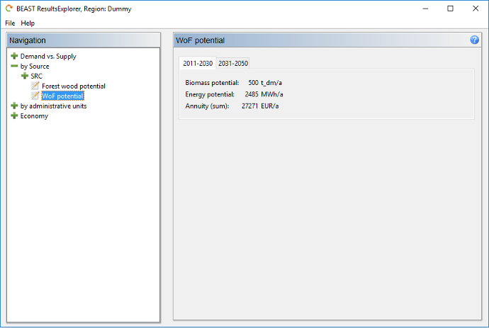
There are only three outputs of the scenario simulation presented for the energy source "Wood Outside Forest" (WoF): total amount of biomass, energy equivalent, and resulting economic annuity sum.
Administrative Units
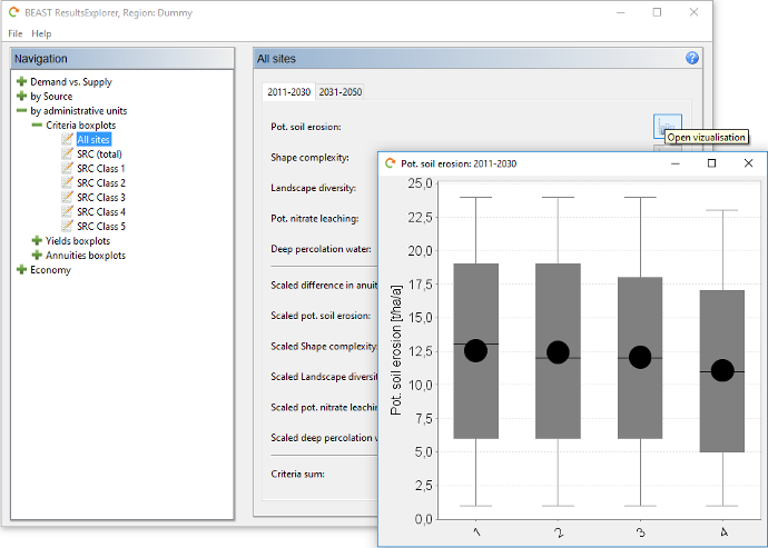
Results can be presented as boxplots seperated for the administrative units. The definition of the units is given by the input data (e.g. municipalities). Three thematic groups are available in the navigation tree: Criteria, Yields, Annuities. In the selection tree on the left you can choose between boxes for all sites of the research area, for the potential SRC sites only or further differentiated into the different preference classes. By pushing the button on the right you can open the corresponding boxplot. You can visualize the results for the different criteria, such as susceptibility to water erosion, shape complexity, etc., in absolute values as well as in scaled criteria values. Furthermore, you can have a look on the criteria sum. There is one box for each administrative unit. On the x-axis the numeric code of the administrative unit is drawn.
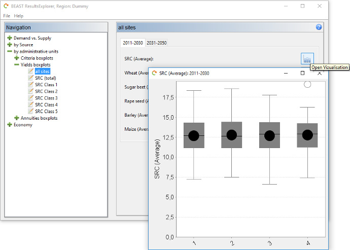
In the selection tree on the left you can choose between boxes for all sites of the research area, for the potential SRC sites only and further differentiated into the different preference classes. For the yield results you can request boxplots for the average yield of SRC and for the different field crops. There is one box for each administrative unit. On the x-axis the numeric code of the administrative unit is drawn.
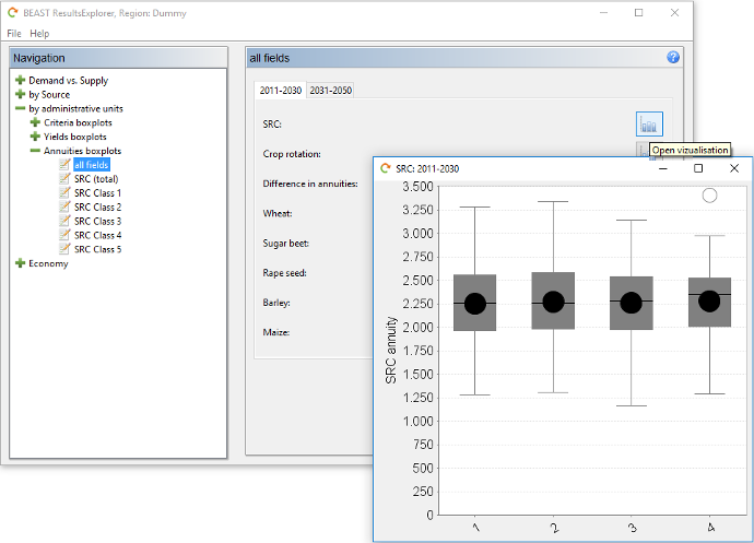
In the same manner as the yields, the results for the annuities are presented. In the selection tree on the left you can choose between boxes for all sites of the research area, for the potential SRC sites only and further differentiated into the different preference classes. For the annuity results you can request boxplots for the average yield of SRC and for the different field crops. There is one box for each administrative unit. On the x-axis the numeric code of the administrative unit is drawn.
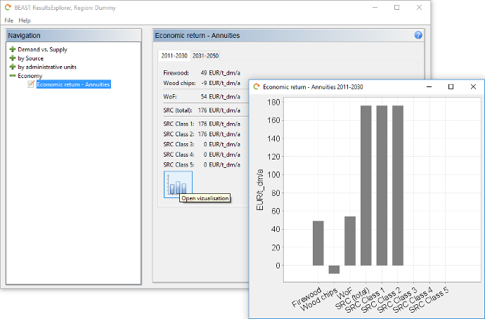
Economy
In this section the economic return of the different biomass sources are shown to be compareable to each other. All annual annuities are given for one ton of dry mass for firewood, wood chips from forest wood, wood from outside forest, and wood from short rotation coppices. Only these SRC preference classes have values where at least one field was assigned to the class. Otherwise the annuity is set to 0.
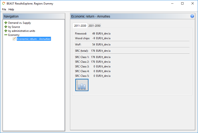
Pushing the chart button at the bottom opens a visualization of the annuities of the different biomass sources in a bar chart. Only these SRC preference classes are plotted into the graph where at least one field was assigned to the class.